ITN Website

About
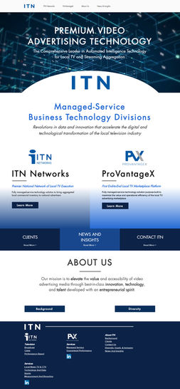
I've done a lot of work this company, and a good portion of that has been on this site. It's gone through a couple iterations in the time that I've been managing it, and I think the current version is the best it has looked, and functioned, in a long time.
Tools
Methods
Graphic Design
Web Design
Video Editing
Brand Identity
Iconography
SEO
Challenges
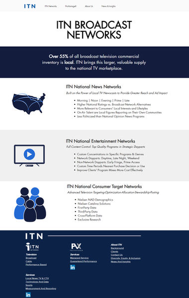
When I started working on this site, it was only for one of subsidiaries of ITN, ITN Networks. This was the first big site that I'd worked on and it involved a lot learning on my part in the beginning. The client wanted custom icons and imagery that I needed to create to suit their character. They really told me they preferred the look of a moving image or clip in the hero section of the site, so we originally went for something generic and techy, but then I had an idea to represent the client (and client's clients') journey in video form for that section. I mocked it up and pitched it, and they loved the idea. That of course meant that I had to learn how to to do a bit of video editing to make it happen, but I'm quite proud of how it turned out.
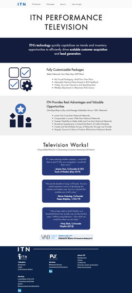
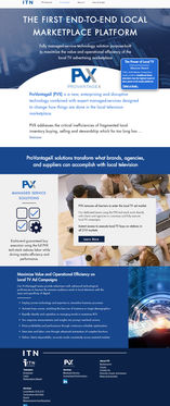
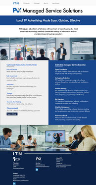
If you go to the site now, you'll notice that the homepage is just ITN, the parent company. This is because they recently asked me to combine the parent, ITN Networks, and other subsidiary PVX, websites all together into one, much more functional and cohesive site where potential clients and investors could find everything in one place. This combination required coordinating with new teams that I hadn't worked with and getting to know how they wanted to approach the change.
In this project, I was given copy to work with. This added some difficulty at times, especially when the copy was a little too verbose. The challenge here wasn't in trying to make it fit on the site, but in communicating how too much text could negatively impact the site. It's wonderful to want to make sure a visitor understands what they're reading, but at a certain point it may just come across as talking in circles without actually saying anything of note.
Personally, I feel like our final design (the current live site), checks all the boxes and functions much more fluidly than the previous versions, especially when they were all separate sites.
Deliverables

Impact and Learning
I have been working on this website in its various stages for a few years now, and it's become a platform for a lot of my design learning. It's taught a great deal about web design and everything that needs to be taken into account during that process. It's seems so basic, but one of the most important lessons I've learned from this project is checking how the site appears on different browsers. Assuming that it will look the same across the board will end in the client quickly finding some text or image out of alignment.
Maintaining the site has also yielded its own learning in the form of making sure that when updates happen to the hosting platform, everything on the site still functions properly and looks as intended. It's happened a couple times where there's been an update to something, and it impacts our design. So keeping an eye on that is critical.
